Designer’s Corner: Gina Clarke on Rally House
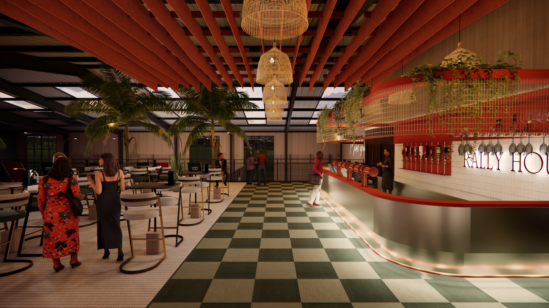
We asked designer Gina about the process behind Rally House. She talks about the overall idea, how she brought elements of sports, hospitality and wellness together into one space, and how she made the space feel unique.
How would you sum up the design concept for Rally House?
A padel house that feels more like a social club than a sportsfacility; fostering connection, wellbeing and performance.
The idea was to designate a higher percentage ofthe overall floor area to hospitality than traditional courts do. We placed astrong emphasis on creating spaces that make people stay, increasing dwell timeand leaving the user with a feeling of finding a second home.
We started the process with a list of bulletpoints, capturing the main elements, features and ideas of the space.
· A social intervention, not a sport-first one. Not asports centre with a cafe; a social space that happens to have a sport.
· A space that will survive long after the padel boom- padel is the magnet, not the mission. A sort of ‘third space’.
· A lifestyle / destination club with a strongF&B concept and other secondary service streams.
· A higher ratio of social space compared to padelspace as a method to increase revenue.
How did the layout and design bring sports, hospitality, and wellness together into one seamless space?
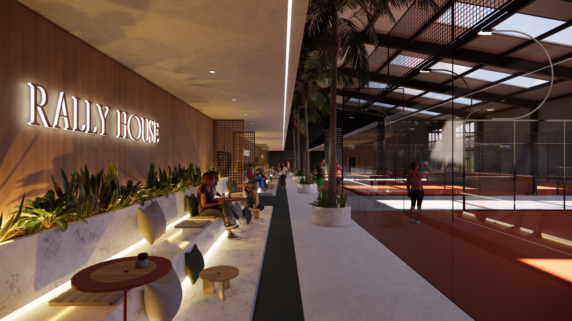
The layout was designed to consider the userjourney of both members and non-members. Everyone enters the space in the samelobby. Non-members can go right to the cafe or upstairs to the bar. They alsohave access to court-side seating via the cafe to watch the game.
Members take a left to bring them straight onto thecourts, with changing and recovery facilities again to their left. We wanted toencourage members to linger post-game so designed a specific staircase formembers to access the first floor, taking them to the gym and bar area straightfrom the changing rooms, without needing to go back to the lobby towards theexit. Focusing on the user journey allowed the layout to develop naturally andcreate flow between areas.
Why was it important to include dedicated bar, fitness, wellness, and recovery zones, rather than just focusing on the courts?
We wanted to create a destination that wouldwithstand the padel-boom, which meant creating a space that people want to stayin, rather than just come and go. The chosen facilities complement padel andhelp to expand the crowd it appeals to beyond just the ’sporty’ type. The ideawas to create a community so that once the padel hype slows down, peoplecontinue to come because, to them, it’s more than just a place to play padel.They’re also additional revenue streams.
What specific materials, textures, or colour palettes define the feel of the space, and why did you choose them?
Whilst the material palette is quite broad, thespaces are united by colour. The deep red/orange from the branding is in justabout every space. To balance this, we used lots of natural materials liketimber, concrete/marble effect, woven flooring, acoustic felt, etc.
We wanted to create a relaxed but premium feel. Thekind of place that no one feels intimidated but still conveys quality. This ledus to balance warm lighting and natural textures with a bold colour palette andpattern.
How did you design to shift the energy from high intensity on the courts to relaxation in the lounge and spa areas?
We toned down the colour in the changing rooms andrecovery area to soften the transition between the high energy spaces and therelaxation spaces. These spaces use more natural finishes. The lounges arestill fairly high-energy spaces in terms of colour and vibe, but soft seatingencourages users to relax and get comfy, opposed to the harder finishescourt-side.
How did you balance functional with a luxurious, elevated feel?
We designed a space that performs like asports facility but feels like a hospitality venue, prioritising robustmaterials and easy-to-maintain finishes, softened with warm lighting, naturaltextures and comfortable furniture. Careful detailing, bespoke joinery and aconsistent material palette elevate the experience without compromisingdurability or functionality.
What is a single 'hero detail' or focal point you want someone to notice immediately?
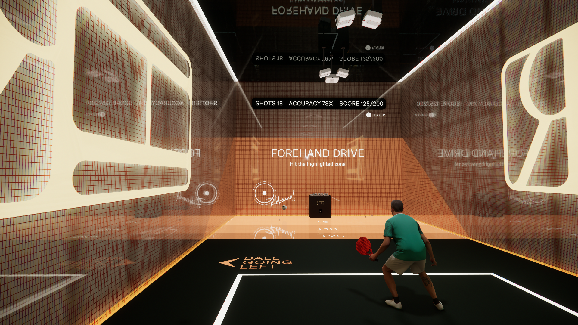
The USP of the space is probably the racket room.We wanted to include something that sets Rally House apart from other courtsfrom a performance perspective. The racket room is an AI powered training room(the first of its kind, I believe) that both professionals and beginners canuse to better their skills. It’s not something you notice immediately, but it’s what gives the place its edge.
Read the full Rally House case study to find out more.